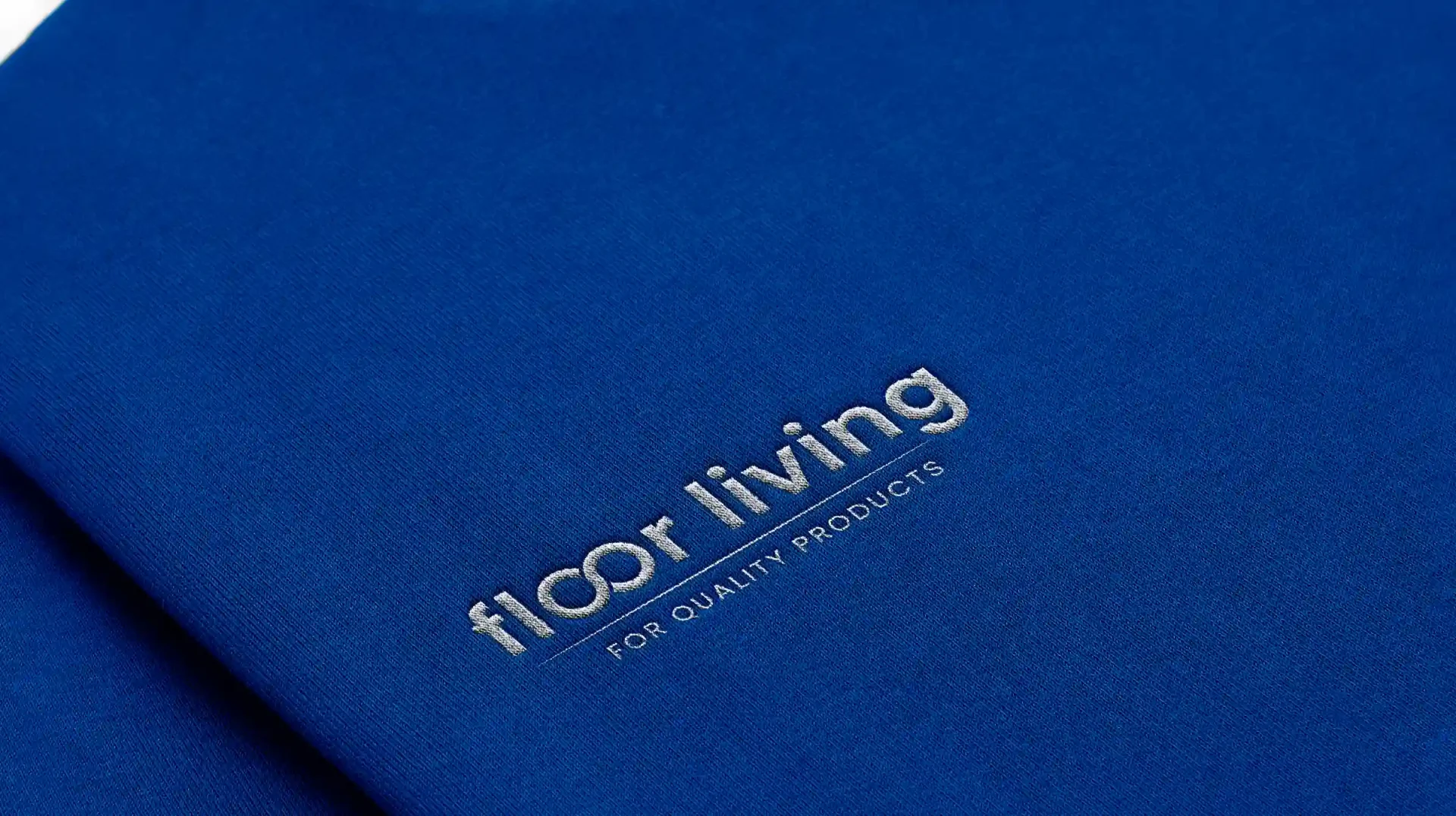
Work Inquiries
moseskimemia05@gmail.com
PL: +48 660 058 318
KE: +254 700 821 779

Floor Living

Step 1:- Understanding the BRAND The client wanted a very clean and modern logo that mainly deals with furniture designed for the floor. E.g. rugs, carpets, coffee tables, and cushions with some small design around them or below them. Just something simple and minimalist logo that speaks with a welcoming voice. The choice of colors is blue and grey. The client’s name is Tom George he resides in Tanzania. The name of the brand is Floor Living.

Brand Vision The client vision is very simple. He wants to sell rugs, carpets, coffee tables, cushions, and household things in general. He wants to position the brand as the most trusted with high-quality products.

Brand Values At the core of our brand, we are purpose-driven, guided by a relentless commitment to integrity, discipline, perseverance, positivity, and unwavering dedication. These values define who we are, shape our decisions, and inspire our actions, ensuring that every step we take reflects our deep-rooted commitment to making a positive impact on the world.


Step 2:- Define target audience: The target audience for floor living are house engineers, interior designers, people who want to do a house makeover, and individuals both male and female. The target group is between 18 and 60 years of age.


What I aspired to achieve:

  1. Timeless Appeal: Achieve a timeless quality that ensures the logo remains relevant and impactful for years to come.
  2. Versatility: A simple and clean design allows for easy scalability, ensuring the logo looks impressive across various platforms and mediums.
  3. Memorability: I wanted to achieve a logo that often sticks in the minds of viewers, making the brand more memorable in a cluttered marketplace.
  4. Adaptability: Wanted to achieve the simplicity of a minimalist logo that makes it adaptable to various color schemes and branding elements, providing flexibility for future marketing strategies.

Design Process:-

Click to enlarge the image


Step 3:- Design Process:-

  • Client Brief: Understanding the client’s business, values, target audience, and unique selling points. Gather information about the client’s preferences, vision, and any specific requirements.
  • Research: Conducted market research to understand the industry, competitors, and trends. Identify successful and unsuccessful logos in the same or related industries.
  • Conceptualization/Draft Ideas: Brainstorm ideas based on the gathered information and research. Sketch out rough concepts and explore various design directions.
  • Sketching and Drafting: Began sketching on paper as a draft and creating initial drafts of the logo concepts. Explore different shapes, symbols, and typography options while keeping it in mind having it as simple as possible in a minimalist way.
  • Digitalization: Choose the most simple logo and easy for me to digitize using graphic design software. Created clean, scalable versions of the selected concept.
  • Refinement: Refined the digital versions by adjusting proportions, colors, and details. Experiment with different color schemes and font choices.
  • Feedback and Iteration: Shared the initial concepts with the client for feedback. Iterate based on the client’s input, making necessary adjustments.
  • Presentation: Prepare a presentation that showcases the finalized logo concepts. Provided reasoning behind design choices and how the logo aligns with the brand.
  • Client Approval: Obtained final approval from the client for the chosen logo design. Ensured that the client is satisfied with the design and any necessary revisions are made.
  • Finalization: Made any final adjustments based on client feedback. Create variations of the logo for different applications (e.g., color, black and white, small sizes).
  • Delivery: Provided the client with the final logo files in various formats (e.g., vector files for scalability, raster files for web use). Include guidelines on logo usage, such as minimum size, color variations, and clear space requirements. and advised the client to consider trademarking the logo for legal protection.

Step 5:- One of the client’s Feedback during the design process:-

Click to enlarge


Step 6:- Why Choice of Color and Meaning:-

  1. Trust and Dependability: Blue is often associated with qualities such as trust, reliability, and dependability. Many financial institutions, banks, and corporate brands use blue in their logos to convey a sense of stability and trustworthiness.
  2. Professionalism: Blue is considered a professional and business-oriented color. It is frequently used in logos for professional services, technology companies, and corporate entities to project a serious and competent image.
  3. Calmness and Serenity: Blue is known for its calming and soothing properties. Brands associated with the color shows wellness and relaxation often incorporate shades of blue to evoke a sense of calmness and serenity.

I am confident that this design approach aligns seamlessly with the brand values and objectives.

Task

The client wanted a sleek and modern logo, embodying to show commitment to floor-centric furniture design.

  • Strategy

    Brand Strategy, UX Strategy

  • Design

    UI Design, Brand Design, Graphic Design

  • Client

    Tom George - Tanzania

  • Software Used

    Adobe Illustrator / Photoshop CC 2021

Open Project
Back