64 Consultants LTD
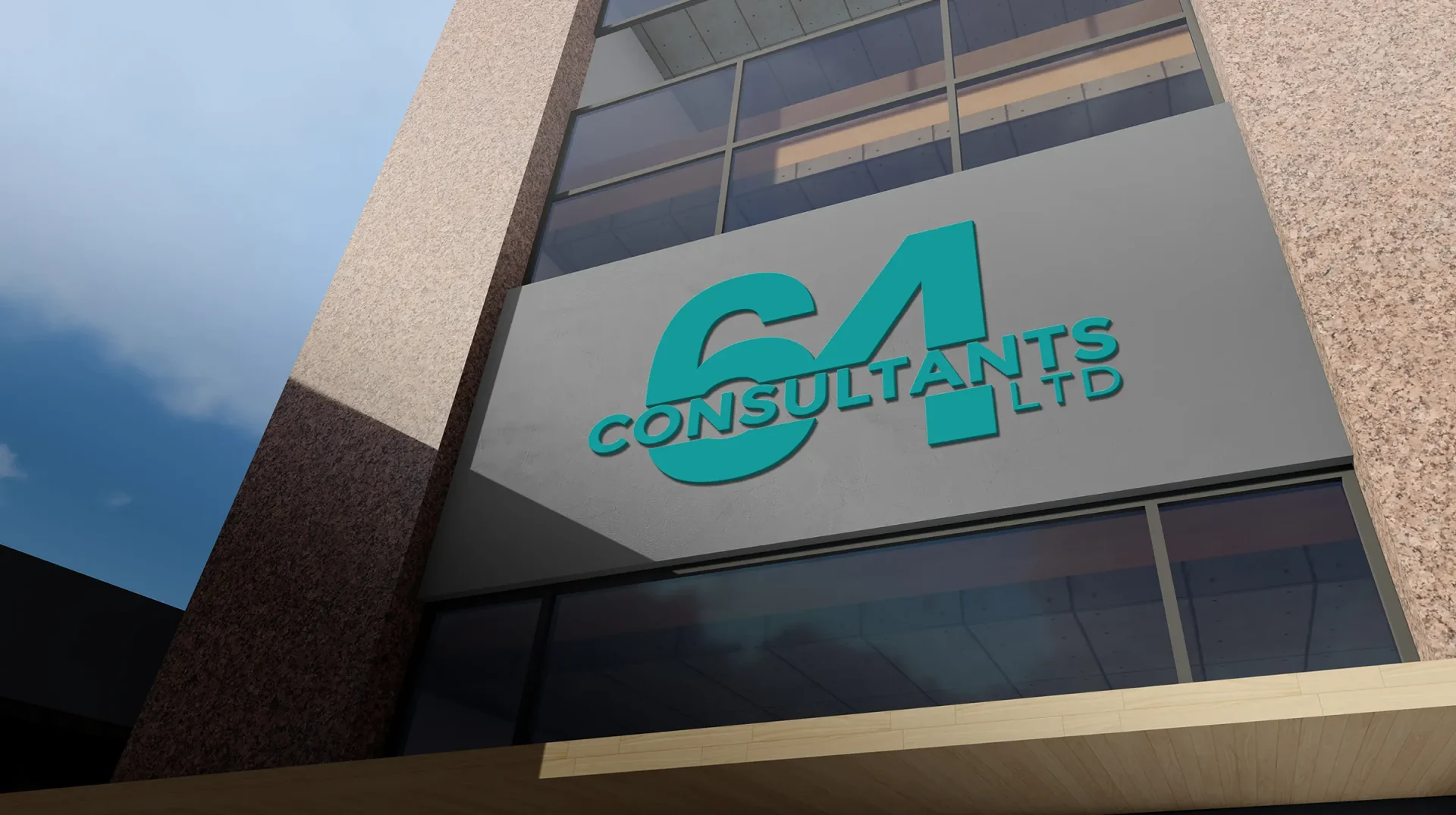
Idea:- The Idea behind this was to create a minimalist type of logo. First I created the number 64 and combined it to be part of the logo to form 64 Consultant Ltd. Why the design? The reason behind the idea was to create a very simple logo and straight to the point by combining elements to create the whole brand.
Process:- To begin, I embraced a design-thinking approach, envisioning how the logo could align with the client’s vision. During the discovery phase, I developed early concepts of the logo and brand elements, exploring a wide range of directions. After thorough exploration, I presented the strongest 2-3 concepts at the end of the design process, ensuring they resonated with the client’s goals and aesthetic preferences.
Timeline: Completion time took 1 week.
Task
I was tasked with designing a logo for a consultancy that assists with taxes and accounting. My goal was to capture the essence of professionalism and trust. Using clean lines, a modern font, and a color palette of blue and gray. The result is a logo that clearly represents the consultancy’s commitment to clarity and reliability in financial services.